

 Security
Dashboards Overview
 Suggest changes
Cloud Insights provides users the flexibility to create operational views of infrastructure data, by allowing you to create custom dashboards with a variety of widgets, each of which provides extensive flexibility in displaying and charting your data.

|
The examples in these sections are for explanation purposes only and do not cover every possible scenario. The concepts and steps herein can be used to create your own dashboards to highlight the data specific to your particular needs. |
Creating a Dashboard
You create a new dashboard in one of two places:
-
Dashboards > [+New dashboard]
-
Dashboards > Show all dashboards > click the [+Dashboard] button
Dashboard Controls
The Dashboard screen has several controls:
-
Time selector: allows you to view dashboard data for a range of time from the last 15 minutes to the last 30 days, or a custom time range of up to 31 days. You can choose to override this global time range in individual widgets.
-
Edit button: Selecting this will enable Edit mode, which allows you to make changes to the dashboard. New dashboards open in Edit mode by default.
-
Save button: Allows you to save or delete the dashboard.
You can rename the current dashboard by typing a new name before clicking Save.
-
Add Widget button, which allows you to add any number of tables, charts, or other widgets to the dashboard.
Widgets can be resized and relocated to different positions within the dashboard, to give you the best view of your data according to your current needs.
Widget types
You can choose from the following widget types:
-
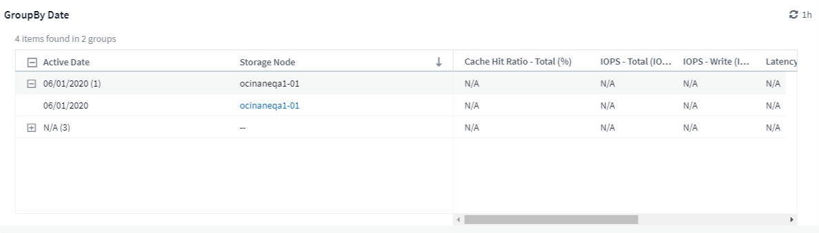
Table widget: A table displaying data according to filters and columns you choose. Table data can be combined in groups that can be collapsed and expanded.
-
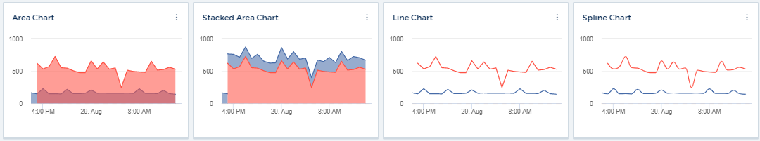
Line, Spline, Area, Stacked Area Charts: These are time-series chart widgets on which you can display performance and other data over time.
-
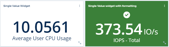
Single Value widget: A widget allowing you to display a single value that can be derived either directly from a counter or calculated using a query or expression. You can define color formatting thresholds to show whether the value is in expected, warning, or critical range.
-
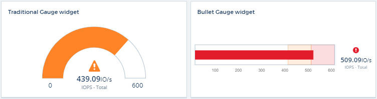
Gauge widget: Displays single-value data in a traditional (solid) gauge or bullet gauge, with colors based on "Warning" or "Critical" values you customize.
-
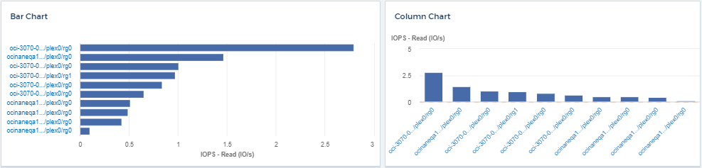
Bar, Column Charts: Displays top or bottom N values, for example, Top 10 storages by capacity or bottom 5 volumes by IOPS.
-
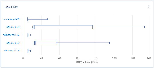
Box Plot Chart: A plot of the min, max, median, and the range between lower and upper quartile of data in a single chart.
-
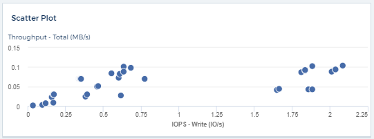
Scatter Plot Chart: Plots related data as points, for example, IOPS and latency. In this example, you can quickly locate assets with high throughput and low IOPS.
-
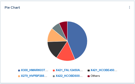
Pie Chart: a traditional pie chart to display data as a piece of the total.
-
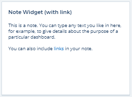
Note widget: Up to 1000 characters of free text.
-
Alerts Table: Displays up to the last 1,000 alerts.
For more detailed explanations of these and other Dashboard Features, click here.
Setting a Dashboard as your Home Page
You can choose which dashboard to set as your environment's home page using either of the following methods:
-
Go to Dashboards > Show All Dashboards to display the list of dashboards in your environment. Click on the options menu to the right of the desired dashboard and select Set as Home Page.
-
Click on a dashboard from the list to open the dashboard. Click the drop-down menu in the upper corner and select Set as Home Page.