Scatterplot Example: knowing your axis
 Suggest changes


Changing the order of counters in a scatterplot widget changes the axes on which the data is displayed.
About this task
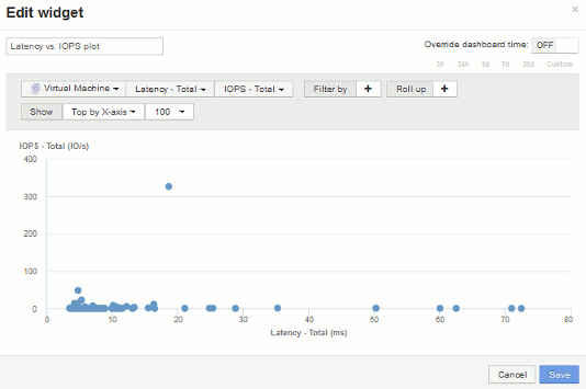
This example will create a scatter plot that will allow you to see under-performing VMs that have high latency compared to low IOPS.
Steps
-
Create or open a dashboard in edit mode and add a Scatter Plot Chart widget.
-
Select an asset type, for example, Virtual Machine.
-
Select the first counter you wish to plot. For this example, select Latency - Total.
Latency - Total is charted along the X-axis of the chart.
-
Select the second counter you wish to plot. For this example, select IOPS - Total.
IOPS - Total is charted along the Y-axis in the chart. VMs with higher latency display on the right side of the chart. Only the top 100 highest-latency VMs are displayed, because the Top by X-axis setting is current.

-
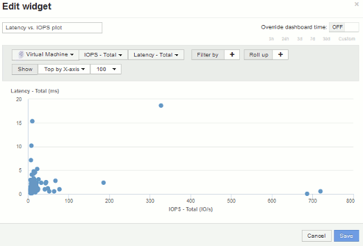
Now reverse the order of the counters by setting the first counter to IOPS - Total and the second to Latency - Total.
Iatency- Total is now charted along the Y-axis in the chart, andIOPS - Total along the X-axis. VMs with higher IOPS now display on the right side of the chart.
Note that because we haven't changed the Top by X-Axis setting, the widget now displays the top 100 highest-IOPS VMs, since this is what is currently plotted along the X-axis.

-
You can choose for the chart to display the Top N by X-axis, Top N by Y-axis, Bottom N by X-axis, or Bottom N by Y-axis. In our final example, the chart is displaying the Top 100 VMs that have the highest total IOPS. If we change it to Top by Y-axis, the chart will once again display the top 100 VMs that have the highest total latency.
Note that in a scatterplot chart, you can click on a point to open the asset page for that resource.


