Storage Manager Dashboard
 Suggest changes


The Storage Manager Dashboard provides you with a centralized visualization that enables you to compare and contrast resource usage over time against the acceptable ranges and previous days of activity. Showing only the key performance metrics for your storage services, you can make decisions about how to maintain your data centers.

|
The Reporting feature is available in Data Infrastructure Insights Premium Edition. |
Summary
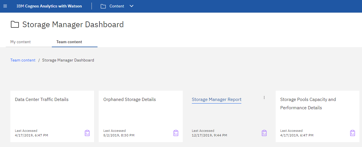
Selecting Storage Manager Dashboard from Team Content gives you several reports that provide information on of your traffic and storage.

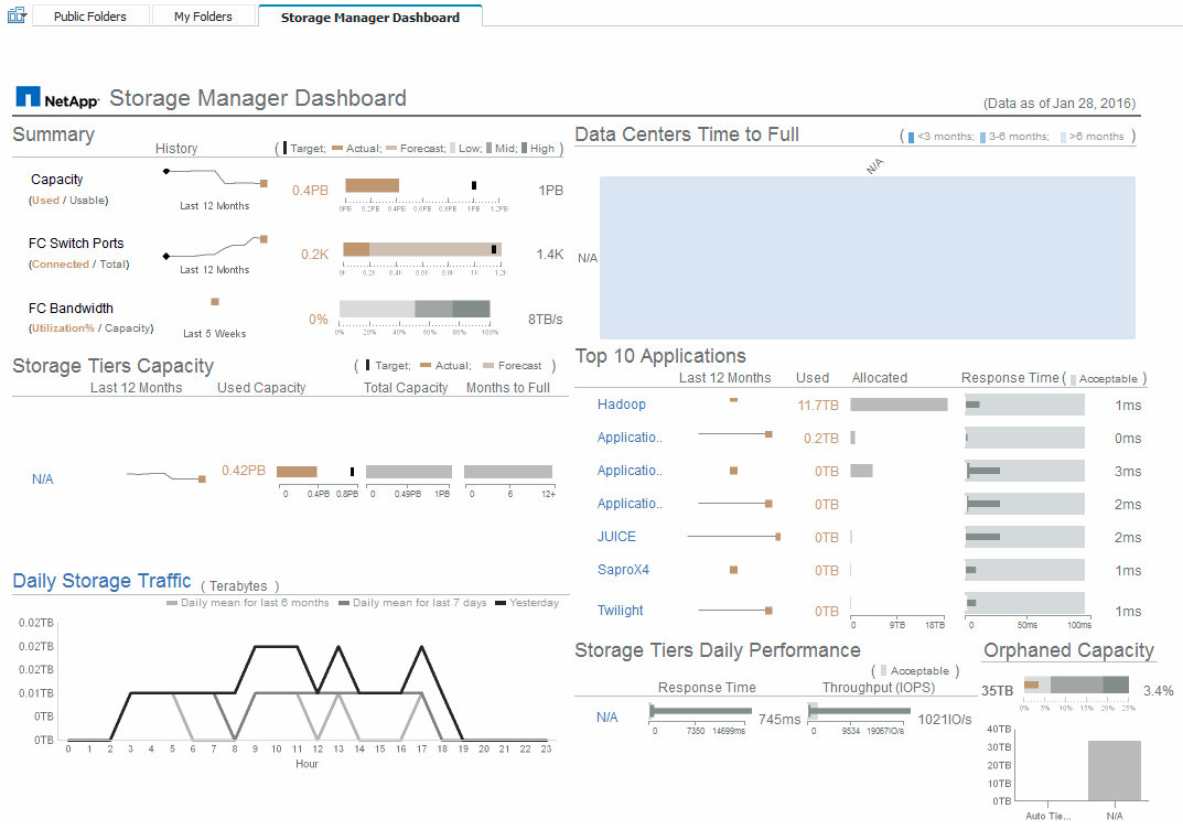
For an at-a-glance view, the Storage Manager Report comprises seven components that contain contextual information on many aspects of your storage environment. You can drill down on the aspects of your storage services to perform an in-depth of analysis of a section that interests you most.

This component shows the used versus usable storage capacity, total switch ports versus the number of switch ports connected, and total connected switch port utilization versus the total bandwidth, and how each of these trend over time. You can view the actual utilization compared against the low, mid, and high ranges, which enables you to compare and contrast usage between projections and your desired actuals, based on a target. For capacity and switch ports, you can configure this target. The forecast is based on an extrapolation of the current growth rate and the date you set. When the forecasted used capacity, which is based on future usage projection date, exceeds the target, an alert (solid red circle) appears next to Capacity.
Storage Tiers Capacity
This component shows the tier capacity used versus the capacity allocated to the tier, which indicates how the used capacity increases or decreases over a 12-month period and how many months are remaining to full capacity. Capacity usage is shown with values provided for actual usage, the usage forecast, and a target for capacity, which you can configure. When the forecasted used capacity, which is based on future usage projection date, exceeds the target capacity, an alert (solid red circle) appears next to a tier.
You can click any tier to display the Storage Pools Capacity and Performance Details report, which shows free versus used capacities, number of days to full, and performance (IOPS and Response Time) details for all the pools in the selected tier. You can also click any storage or storage pool name in this report to display the asset page summarizing the current state of that resource.
Daily Storage Traffic
This component shows how the environment is performing, if there is any large growth, changes, or potential issues compared to the previous six months. It also shows the average traffic versus the traffic for the previous seven days, and for the previous day. You can visualize any abnormalities in the way the infrastructure is performing because it provides information that highlights both cyclical (previous seven days) and seasonal variations (previous six months).
You can click the title (Daily Storage Traffic) to display the Storage Traffic Details report, which shows the heat map of the hourly storage traffic for the previous day for each storage system. Click any storage name in this report to display the asset page summarizing the current state of that resource.
Data Centers Time to Full
This component shows all the data centers versus all of the tiers and how much capacity remains in each data center for each tier of storage based on forecasted growth rates. Tier capacity level is shown in blue; the darker the color, the lesser time the tier at the location has left before it is full.
You can click a section of a tier to display the Storage Pools Days to Full Details report, which shows total capacity, free capacity, and number of days to full for all the pools in the selected tier and the data center. Click any storage or storage pool name in this report to display the asset page summarizing the current state of that resource.
Top 10 Applications
This component shows the top 10 applications based on the used capacity. Regardless of how the tier organizes the data, this area displays the current used capacity and share of the infrastructure. You can visualize the range of user experience for the previous seven days to see if consumers experience acceptable (or, more importantly, unacceptable) response times.
This area also shows trending, which indicates if the applications meet their performance service level objectives (SLO). You can view the previous week's minimum response time, the first quartile, the third quartile, and the maximum response time, with a median shown against an acceptable SLO, which you can configure. When the median response time for any application is out of the acceptable SLO range, an alert (solid red circle) appears next to the application. You can click an application to display the asset page summarizing the current state of that resource.
Storage Tiers Daily Performance
This component shows a summary of the tier's performance for response time and IOPS for the previous seven days. This performance is compared against a SLO, which you can configure, enabling you to see if there is opportunity to consolidate tiers, realign workloads delivered from those tiers, or identify issues with particular tiers. When median response time or median IOPS is out of the acceptable SLO range, an alert (solid red circle) appears next to a tier.
You can click a tier name to display the Storage Pools Capacity and Performance Details report, which shows free versus used capacities, number of days to full, and performance (IOPS and response time) details for all the pools in the selected tier. Click any storage or storage pool in this report to display the asset page summarizing the current state of that resource.
Orphaned Capacity
This component shows the total orphaned capacity and orphaned capacity by tier, comparing it against acceptable ranges for total usable capacity and showing the actual capacity that is orphaned. Orphaned capacity is defined by configuration and by performance. Storage orphaned by configuration describes a situation in which there is storage allocated to a host. However, the configuration has not been performed properly and the host cannot access the storage. Orphaned by performance is when the storage is correctly configured to be accessed by a host. However, there has been no storage traffic.
The horizontal stacked bar shows the acceptable ranges. The darker the gray, the more unacceptable the situation is. The actual situation is shown with the narrow bronze bar that shows the actual capacity that is orphaned.
You can click a tier to display the Orphaned Storage Details report, which shows all the volumes identified as orphaned by configuration and performance for the selected tier. Click any storage, storage pool, or volume in this report to display the asset page summarizing the current state of that resource.


