

Best Practices for Dashboards and Widgets
 Suggest changes
Tips and tricks to help you get the most out of the powerful features of dashboards and widgets.
Finding the Right Metric
Data Infrastructure Insights acquires counters and metrics using names that sometimes differ from data collector to data collector.
When searching for the right metric or counter for your dashboard widget, keep in mind that the metric you want could be under a different name from the one you are thinking of. While drop-down lists in Data Infrastructure Insights are usually alphabetical, sometimes a term may not show up in the list where you think it should. For example, terms like "raw capacity" and "used capacity" do not appear together in most lists.
Best practice: Use the search feature in fields such as Filter by or places like the column selector to find what you are looking for. For example, searching for "cap" will show all metrics with "capacity" in their names, no matter where they occur in the list. You can then easily select the metrics you want from that shorter list.
Here are a few alternative phrases you can try when searching for metrics:
When you want to find: |
Try also searching for: |
CPU |
Processor |
Capacity |
Used capacity |
Disk Speed |
Lowest disk speed |
Host |
Hypervisor |
Hypervisor |
Host |
Microcode |
Firmware |
Name |
Alias |
Read / Write |
Partial R/W |
Virtual Machine |
VM |
This is not a comprehensive list. These are examples of possible search terms only.
Finding the Right Assets
The assets you can reference in widget filters and searches vary from asset type to asset type.
In dashboards and asset pages, the asset type around which you are building your widget determines the other asset type counters for which you can filter or add a column. Keep the following in mind when building your widget:
This asset type / counter: |
Can be filtered for under these assets: |
Virtual Machine |
VMDK |
Datastore(s) |
Internal Volume |
Hypervisor |
Virtual Machine |
Host(s) |
Internal Volume |
Fabric |
Port |
This is not a comprehensive list.
Best practice: If you are filtering for a particular asset type that does not appear in the list, try building your query around an alternate asset type.
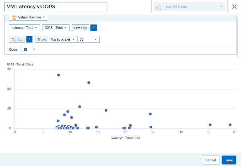
Scatter Plot Example: Knowing your Axis
Changing the order of counters in a scatter plot widget changes the axes on which the data is displayed.
This example will create a scatter plot that will allow you to see under-performing VMs that have high latency compared to low IOPS.
-
Create or open a dashboard in edit mode and add a Scatter Plot Chart widget.
-
Select an asset type, for example, Virtual Machine.
-
Select the first counter you wish to plot. For this example, select Latency - Total.
Latency - Total is charted along the X-axis of the chart.
-
Select the second counter you wish to plot. For this example, select IOPS - Total.
IOPS - Total is charted along the Y-axis in the chart. VMs with higher latency display on the right side of the chart. Only the top 100 highest-latency VMs are displayed, because the Top by X-axis setting is current.
-
Now reverse the order of the counters by setting the first counter to IOPS - Total and the second to Latency - Total.
Latency- Total is now charted along the Y-axis in the chart, and IOPS - Total along the X-axis. VMs with higher IOPS now display on the right side of the chart.
Note that because we haven't changed the Top by X-Axis setting, the widget now displays the top 100 highest-IOPS VMs, since this is what is currently plotted along the X-axis.
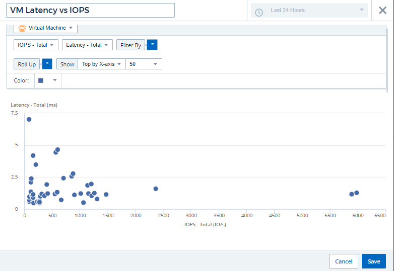
You can choose for the chart to display the Top N by X-axis, Top N by Y-axis, Bottom N by X-axis, or Bottom N by Y-axis. In our final example, the chart is displaying the Top 100 VMs that have the highest total IOPS. If we change it to Top by Y-axis, the chart will once again display the top 100 VMs that have the highest total latency.
Note that in a scatter plot chart, you can click on a point to drill down to the asset page for that resource.