Compare metrics-A against metrics-B to show categories and anomalies
 Suggest changes


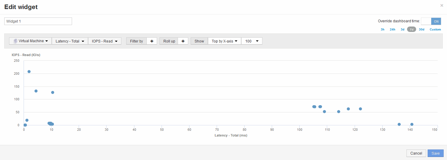
You can use a scatter plot to show two sets of data for each object. For example, you can specify IOPS Read and Latency Total to be displayed for each object. Using this chart you can identify the object you consider troublesome based on both the IOPS and the Latency combined.
Steps
-
Add a widget with a scatter plot chart to the to the new dashboard: Widget > Scatter Plot Chart
-
Change the default device to Virtual machine: Click Storage > Virtual machine > Latency total > IOPS Read
The system displays a scatter plot similar to the following:


