

Use charts and graphs
 Suggest changes
You can use charts and reports to monitor the state of the StorageGRID system and troubleshoot problems.
Types of charts
Charts and graphs summarize the values of specific StorageGRID metrics and attributes.
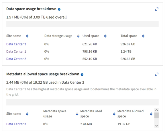
The Grid Manager dashboard includes cards that summarize available storage for the grid and each site.
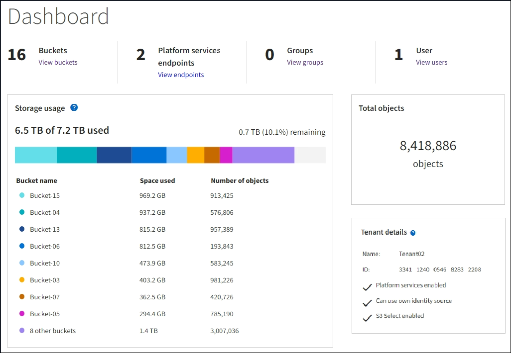
The Storage usage panel on the Tenant Manager dashboard displays the following:
-
A list of the largest buckets (S3) or containers (Swift) for the tenant
-
A bar chart that represents the relative sizes of the largest buckets or containers
-
The total amount of space used and, if a quota is set, the amount and percentage of space remaining
In addition, graphs that show how StorageGRID metrics and attributes change over time are available from the Nodes page and from the SUPPORT > Tools > Grid topology page.
There are four types of graphs:
-
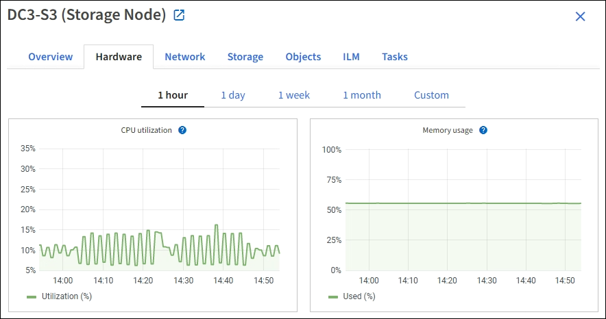
Grafana charts: Shown on the Nodes page, Grafana charts are used to plot the values of Prometheus metrics over time. For example, the NODES > Network tab for a Storage Node includes a Grafana chart for network traffic.
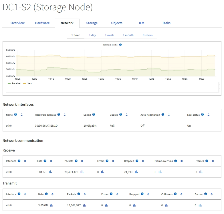

Grafana charts are also included on the pre-constructed dashboards available from the SUPPORT > Tools > Metrics page. -
Line graphs: Available from the Nodes page and from the SUPPORT > Tools > Grid topology page (select the chart icon
 after a data value), line graphs are used to plot the values of StorageGRID attributes that have a unit value (such as NTP Frequency Offset, in ppm). The changes in the value are plotted in regular data intervals (bins) over time.
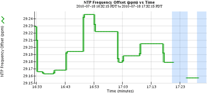
-
Area graphs: Available from the Nodes page and from the SUPPORT > Tools > Grid topology page (select the chart icon
after a data value), area graphs are used to plot volumetric attribute quantities, such as object counts or service load values. Area graphs are similar to line graphs, but include a light brown shading below the line. The changes in the value are plotted in regular data intervals (bins) over time.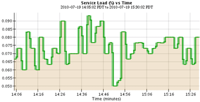
-
Some graphs are denoted with a different type of chart icon
and have a different format: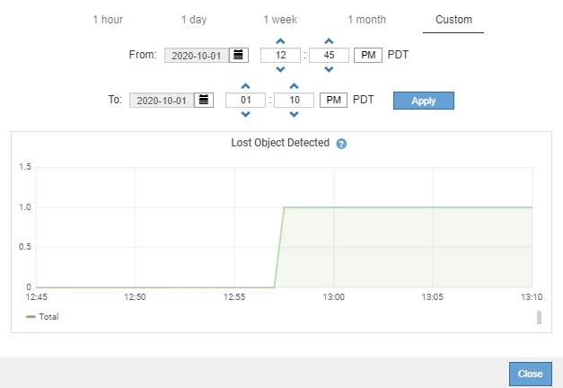
-
State graph: Available from the SUPPORT > Tools > Grid topology page (select the chart icon
after a data value), state graphs are used to plot attribute values that represent distinct states such as a service state that can be online, standby, or offline. State graphs are similar to line graphs, but the transition is discontinuous; that is, the value jumps from one state value to another.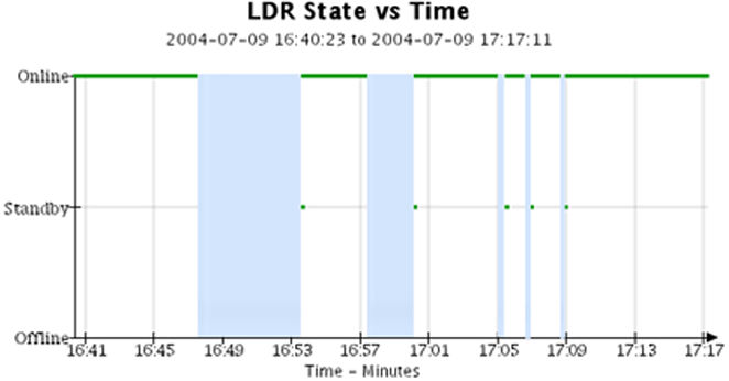
Chart legend
The lines and colors used to draw charts have specific meaning.
| Sample | Meaning |
|---|---|
|
Reported attribute values are plotted using dark green lines. |
|
Light green shading around dark green lines indicates that the actual values in that time range vary and have been “binned” for faster plotting. The dark line represents the weighted average. The range in light green indicates the maximum and minimum values within the bin. Light brown shading is used for area graphs to indicate volumetric data. |
|
Blank areas (no data plotted) indicate that the attribute values were unavailable. The background can be blue, gray, or a mixture of gray and blue, depending on the state of the service reporting the attribute. |
|
Light blue shading indicates that some or all of the attribute values at that time were indeterminate; the attribute was not reporting values because the service was in an unknown state. |
|
Gray shading indicates that some or all of the attribute values at that time were not known because the service reporting the attributes was administratively down. |
|
A mixture of gray and blue shading indicates that some of the attribute values at the time were indeterminate (because the service was in an unknown state), while others were not known because the service reporting the attributes was administratively down. |


Display charts and graphs
The Nodes page contains the charts and graphs you should access regularly to monitor attributes such as storage capacity and throughput. In some cases, especially when working with technical support, you can use the SUPPORT > Tools > Grid topology page to access additional charts.
You must be signed in to the Grid Manager using a supported web browser.
-
Select NODES. Then, select a node, a site, or the entire grid.
-
Select the tab for which you want to view information.
Some tabs include one or more Grafana charts, which are used to plot the values of Prometheus metrics over time. For example, the NODES > Hardware tab for a node includes two Grafana charts.
-
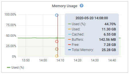
Optionally, position your cursor over the chart to see more detailed values for a particular point in time.
-
As required, you can often display a chart for a specific attribute or metric. From the table on the Nodes page, select the chart icon
to the right of the attribute name.
Charts aren't available for all metrics and attributes. Example 1: From the Objects tab for a Storage Node, you can select the chart icon
to see the total number of successful metadata store queries for the Storage Node.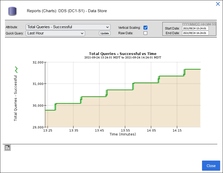
Example 2: From the Objects tab for a Storage Node, you can select the chart icon
to see the Grafana graph of the count of lost objects detected over time.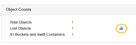
-
To display charts for attributes that aren't shown on the Node page, select SUPPORT > Tools > Grid topology.
-
Select grid node > component or service > Overview > Main.
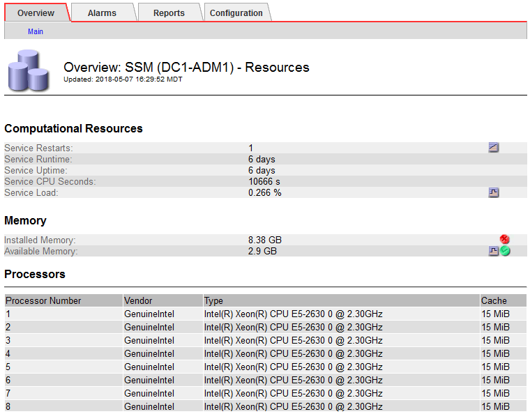
-
Select the chart icon
next to the attribute.The display automatically changes to the Reports > Charts page. The chart displays the attribute's data over the past day.
Generate charts
Charts display a graphical representation of attribute data values. You can report on a data center site, grid node, component, or service.
-
You must be signed in to the Grid Manager using a supported web browser.
-
You must have specific access permissions.
-
Select SUPPORT > Tools > Grid topology.
-
Select grid node > component or service > Reports > Charts.
-
Select the attribute to report on from the Attribute drop-down list.
-
To force the Y-axis to start at zero, clear the Vertical Scaling checkbox.
-
To show values at full precision, select the Raw Data checkbox, or to round values to a maximum of three decimal places (for example, for attributes reported as percentages), clear the Raw Data checkbox.
-
Select the time period to report on from the Quick Query drop-down list.
Select the Custom Query option to select a specific time range.
The chart appears after a few moments. Allow several minutes for tabulation of long time ranges.
-
If you selected Custom Query, customize the time period for the chart by entering the Start Date and End Date.
Use the format
YYYY/MM/DDHH:MM:SSin local time. Leading zeros are required to match the format. For example, 2017/4/6 7:30:00 fails validation. The correct format is: 2017/04/06 07:30:00. -
Select Update.
A chart is generated after a few seconds. Allow several minutes for tabulation of long time ranges. Depending on the length of time set for the query, either a raw text report or aggregate text report is displayed.